
Last updated: November 4, 2026
Quick answer: Botanical prints endure in interior design because they sit at a rare intersection of art, science, and nature, giving them cultural weight that purely decorative pieces rarely achieve.
Key takeaways
- Choosing the right botanical print begins with reading the existing personality of your room rather than imposing a new one.
- Framed botanical art and botanical wallpaper each solve different design problems, and the better choice depends entirely on the commitment level you want and the architectural character of your space.
- The range of botanical print styles available to luxury buyers is broader now than at any previous point.
- A well-executed botanical gallery wall depends on planning the negative space as carefully as the art itself, which is where most amateur arrangements go wrong.
- Botanical prints harmonize most naturally with furniture and textiles that share their organic origins, though the pairing rules are more flexible than most decorators suggest.
Few design choices carry the quiet authority that botanical prints bring to a well-appointed room. These nature-inspired artworks have graced the walls of grand estates and cultured townhomes for centuries, and their appeal has never dimmed. Botanical prints are a category of fine art that blends scientific precision with genuine aesthetic beauty, making them as at home in a sophisticated library as they are in a sun-drenched breakfast room. Whether you are drawn to vintage botanical illustrations, tropical leaf prints, or contemporary botanical watercolor prints, this guide will walk you through every decision you need to make with confidence.

Botanical Prints: What Makes Them a Timeless Decor Choice
Botanical prints endure in interior design because they sit at a rare intersection of art, science, and nature, giving them cultural weight that purely decorative pieces rarely achieve. Unlike trend-driven wall art, framed plant prints carry documented history.
The visual language of botanical wall art is also unusually versatile. A finely rendered herbarium print in muted ochre and sage reads as scholarly in a home office, while a vivid tropical leaf print in emerald and coral energizes a guest bedroom. This adaptability is one reason interior designers return to them across dramatically different project briefs. They function equally well as statement art pieces and as quiet background texture in a layered gallery wall.
Color psychology plays a role too. Greens and earthy neutrals, the dominant palette in most botanical art prints, are consistently associated with calm and restorative environments. Antique botanical engravings with their sepia undertones add warmth without overwhelming other design choices.
Fine art botanical posters printed on archival paper, original pressed flower art under museum glass, and Audubon-style prints depicting rare flora all fall under this broad and rewarding category.

How Do You Choose the Right Botanical Print for Your Space?
Choosing the right botanical print begins with reading the existing personality of your room rather than imposing a new one. A print should feel inevitable in its setting, not like an afterthought. Start by identifying your room’s dominant undertone. Cool, gray-based rooms respond well to steel-blue botanical watercolor prints or crisp black-and-white antique botanical engravings. Warm, cream-toned spaces absorb vintage botanical illustrations with golden or terracotta backgrounds beautifully.
Scale is the next consideration, and it is one that buyers routinely underestimate. A small framed plant print that might be perfect above a console table will disappear entirely above a generous sectional sofa. Art placed above a sofa should ideally span roughly two-thirds of the furniture’s width to achieve visual balance. That guideline applies whether you are hanging a single large botanical poster or a cluster of smaller green wall decor pieces arranged as a unit.
Subject matter also carries meaning. Tropical leaf prints communicate a relaxed, maximalist energy that suits sunrooms, dining rooms, and bathrooms with bold tile work. More restrained herbarium prints or delicate pressed flower art suit bedrooms and reading corners where a quieter visual rhythm feels right. If your home already contains significant pattern in upholstery or rugs, look for botanical prints with generous white or cream margins and simple compositions. They will breathe without competing.
Finally, consider the print’s origin story. Museum-quality art prints produced from original plates or authenticated watercolors hold their value differently than high-resolution digital reproductions. If you are buying for longevity and investment potential, provenance documentation matters. The American Society of Interior Designers (2026) encourages clients to request certificates of authenticity and edition information whenever purchasing fine art for residential interiors.
Framed Botanical Art vs. Wallpaper: Which Option Works Best?
Framed botanical art and botanical wallpaper each solve different design problems, and the better choice depends entirely on the commitment level you want and the architectural character of your space. Framed prints give you flexibility. You can rehang, regroup, and replace individual pieces as your taste evolves without touching your walls. Wallpaper is a full commitment, but it delivers an immersive environment that framed prints simply cannot replicate on their own.
For rooms with beautiful architectural detail, such as deep crown molding, wainscoting, or coffered ceilings, framed botanical art tends to honor those features by leaving them visible. Wallpaper, particularly large-scale tropical leaf prints or William Morris-inspired botanical patterns, can overpower delicate architectural detail in smaller rooms. The most successful botanical wallpaper installations in luxury homes tend to appear in rooms with strong natural light and at least one plain, neutral surface to balance the pattern load.
A hybrid approach works well in many luxury interiors. A single accent wall of botanical wallpaper paired with two or three carefully chosen framed plant prints on adjacent walls creates depth without visual chaos. Art print framing choices become especially important in this scenario. Frames that echo a color already present in the wallpaper pattern unify the scheme. Simple natural wood or matte black frames keep the focus on the botanical imagery itself rather than the hardware surrounding it.
Cost is another practical factor. High-quality wallpaper installation in a single room, including material and labor, can reach several thousand dollars. A curated set of museum-quality art prints in quality frames can be staged gradually, which suits decorating budgets that unfold over time. Layering art acquisitions over months or years is a hallmark of how experienced collectors build meaningful interiors rather than purchasing everything at once.
Top Botanical Print Styles for High-End Interior Design
The range of botanical print styles available to luxury buyers is broader now than at any previous point, which makes a working knowledge of the main categories genuinely useful before you shop. Each style carries its own visual signature and pairs with different interior aesthetics.
Vintage botanical illustrations, modeled on the hand-colored engravings produced by 18th and 19th century natural history publishers, are among the most sought-after styles in high-end interior design. Their fine linework, restrained palettes, and scholarly character make them ideal for traditional, transitional, and maximalist rooms alike.
Audubon style prints, while technically devoted to birds, almost always feature richly detailed botanical backgrounds, making them a sophisticated crossover between interior plant artwork and wildlife art. They read as grand and erudite, suited to paneled libraries and formal dining rooms.
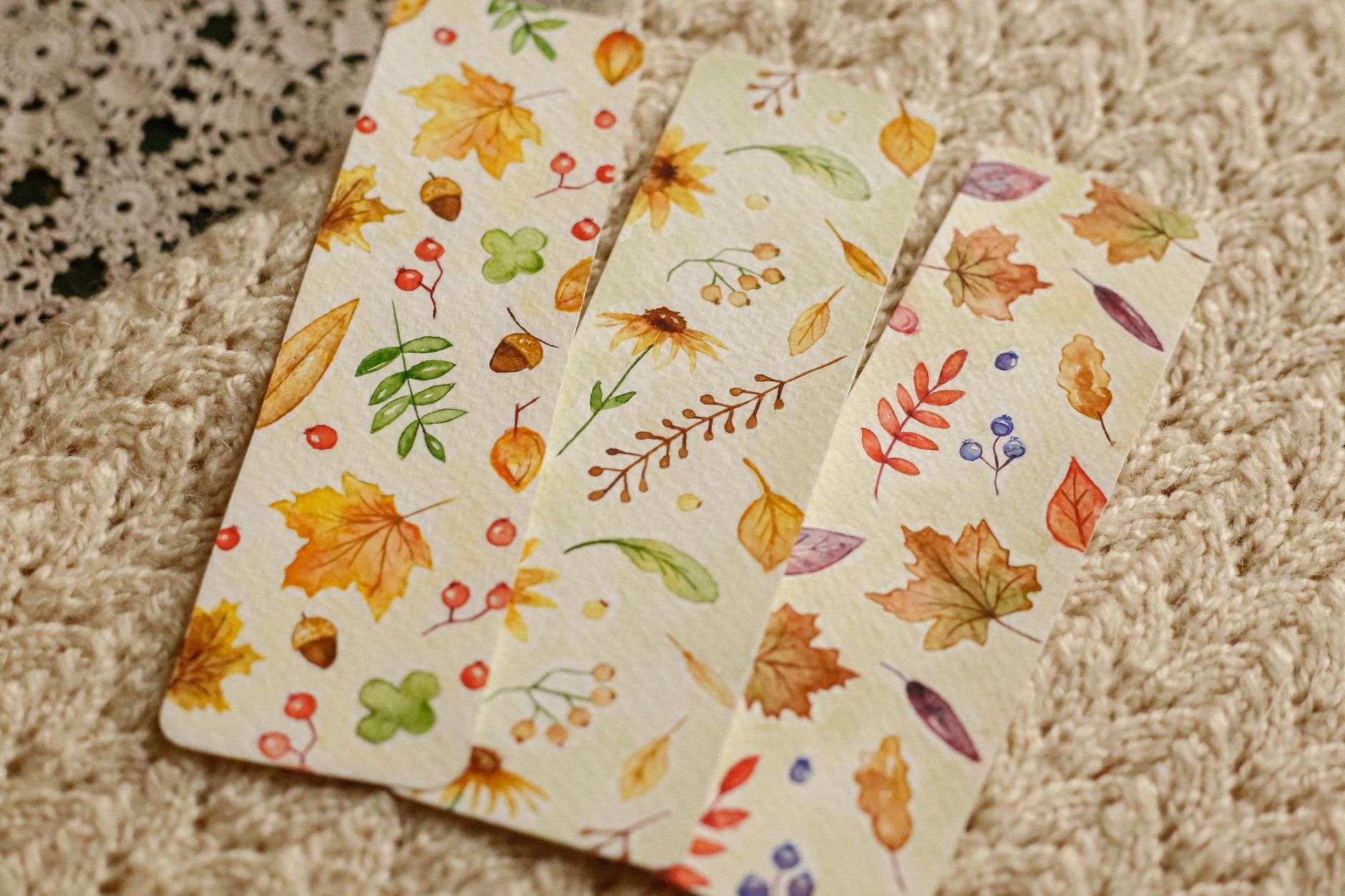
Botanical watercolor prints represent the softer, more painterly end of the spectrum. Their loose washes and visible brush texture introduce handmade warmth that printed reproductions of engravings cannot offer. They work particularly well in bedrooms and spa-style bathrooms where sensory softness is a priority.
Tropical leaf prints, rendered in bold, graphic lines with high-contrast color, suit contemporary and biophilic interiors. Their larger scale and simplified forms hold their own against strong architectural lines and industrial materials like concrete and steel. Pressed flower art, which encases actual botanical specimens behind glass, occupies a unique niche as three-dimensional fine art rather than a flat reproduction, and it commands correspondingly higher prices in the collector market.
| Item | Material or Style | Best For | Price Tier |
|---|---|---|---|
| Vintage Botanical Illustration | Archival giclée on cotton rag paper | Traditional, transitional, and library spaces | $$–$$$ |
| Pressed Flower Art | Actual botanical specimens under museum glass | Statement pieces in bedrooms and entryways | $$$–$$$$ |
| Botanical Watercolor Print | Hand-painted original or fine art reproduction | Bedrooms, bathrooms, and feminine living rooms | $$–$$$$ |
| Tropical Leaf Print | High-resolution print on heavyweight matte stock | Contemporary, biophilic, and maximalist rooms | $–$$$ |
| Antique Botanical Engraving (Original) | Period copper or steel plate engraving on laid paper | Collector-level investment art in formal rooms | $$$$ |

What Size and Layout Works Best for Botanical Gallery Walls?
A well-executed botanical gallery wall depends on planning the negative space as carefully as the art itself, which is where most amateur arrangements go wrong. The space between frames should be consistent, typically three to four inches between pieces, to create visual order without rigidity. Larger anchor prints placed at eye level provide a gravitational center, and smaller herbarium prints or fine art botanical posters can radiate outward from that core.
Standard eye level for gallery wall arrangements is approximately 57 to 60 inches from the floor to the center of the grouping, a convention borrowed from professional museum hanging practices. Mixing frame sizes within a botanical gallery wall creates dynamism, but mixing more than two or three frame finishes in the same grouping risks a scattered rather than curated appearance.
For a wall above a sofa, a horizontal arrangement of three to five botanical prints in matching or coordinating frames tends to read as deliberate and polished. A staircase wall benefits from a diagonal or asymmetric arrangement that follows the rake of the stairs. Entryways, where wall space is often narrow and vertical, respond well to a single column of two or three stacked prints in elongated vertical formats.
Before committing nails to plaster, trace each frame onto kraft paper, cut out the shapes, and tape them to the wall with painter’s tape. This low-risk mockup lets you test spacing and proportion without damage. Luxury interior plant artwork deserves that level of care in its placement. You can also find gallery wall ideas in resources like our guide to 13 affordable minimalist wall decor ideas for living rooms, which covers foundational arrangement principles applicable to any art style.
Pairing Botanical Prints with Luxury Furniture and Textiles
Botanical prints harmonize most naturally with furniture and textiles that share their organic origins, though the pairing rules are more flexible than most decorators suggest. Linen, cotton velvet, and natural wool in earthy or muted tones all complement the organic character of botanical wall art without competing for attention. Silk and dupioni in soft sage, dusty rose, or warm ivory create a refined backdrop that allows even complex vintage botanical illustrations to read clearly from across the room.
Dark wood furniture, particularly walnut and ebonized oak, grounds a botanical print arrangement by anchoring the eye. Lighter woods like cerused oak and bleached ash keep the overall palette airy and Scandinavian in feeling. The current preference among high-end residential clients leans toward natural material pairings that reinforce a coherent narrative of nature brought indoors rather than decorative elements assembled without relationship to each other.
Metallic accents in brass or unlacquered bronze pair particularly well with vintage botanical illustrations and antique botanical engravings because the warm metal tones echo the antique, golden quality of period paper and hand-applied color.
Textiles with subtle botanical or organic patterns, think a linen cushion with a faint leaf-stamp texture or a wool throw with a lichen-inspired weave, reinforce the botanical theme without duplicating the wall art. The key is variation in scale and rendering. A large-scale printed botanical on the wall paired with a small-scale woven botanical on the cushion reads as intentional layering rather than repetition.
Where Can You Buy Investment-Worthy Botanical Prints Online?
Sourcing museum-quality art prints online requires knowing which platforms apply rigorous standards to the provenance, printing process, and paper quality they offer. The most reliable options for luxury buyers fall into three categories: fine art marketplaces, specialist botanical print dealers, and museum shop platforms.
Fine art marketplaces such as Artsy and 1stDibs offer vetted original works and authenticated antique botanical engravings from established galleries. Prices reflect provenance and rarity, and buyer protection policies are generally strong. Museum online shops, including those operated by the Metropolitan Museum of Art and the British Museum, sell high-quality reproductions of works in their permanent collections. These prints are produced under licensing agreements that guarantee fidelity to the original, making them a trustworthy entry point for buyers new to the category.
Specialist botanical print dealers, some of whom operate exclusively online, focus on period prints from natural history publications. They typically provide detailed condition reports, provenance documentation, and will often frame prints to your specification using archival materials. Interior designers sourcing fine botanical art for clients frequently use these specialists precisely because the documentation they provide supports the long-term value of the acquisition.
For contemporary botanical watercolor prints and fine art botanical posters by living artists, platforms like Society6, Minted, and Saatchi Art offer a wide range of price points with clear information about print run size and production method. Always filter for open edition versus limited edition status, and confirm that archival inks and acid-free paper are used before purchasing anything you intend to frame and display permanently. For broader context on decorating on a considered budget, our article on budget-friendly minimalist home decor tips offers practical framing and display strategies that apply across price tiers.
How Do You Care for and Preserve Fine Botanical Art Prints?
Proper care for fine botanical art prints begins at the moment of framing and depends almost entirely on the materials used to protect the work from its environment. Museum-quality preservation requires UV-filtering glass or acrylic, acid-free matting, and an archival backing board that prevents off-gassing from degrading the paper and pigments over time. Many collectors make the mistake of framing valuable prints in standard glass without UV protection, which allows ambient light to fade pigments within just a few years of display.
Humidity is the other primary threat to paper-based art. Bathrooms and kitchens, despite their decorative appeal as venues for green wall decor, expose prints to fluctuating moisture levels that cause paper to buckle, mold to develop, and adhesives to fail. If you want botanical prints in a bathroom, choose prints on metal or canvas substrate rather than paper, or install a reliable ventilation system and monitor humidity with a hygrometer.
Direct sunlight, even through standard window glass, accelerates fading significantly. Hang prints on walls that receive indirect or diffused light whenever possible. If a prime wall position receives direct afternoon sun, consider UV-filtering window film as an additional layer of protection rather than relocating the art to a less prominent position.
Dusting frames with a soft, dry cloth prevents buildup without introducing moisture or abrasive particles. Never spray cleaning products directly onto glass covering art, as liquid can seep beneath the frame rabbet and contact the print surface. For antique botanical engravings and pressed flower art with particular monetary or sentimental value, a professional conservator should assess the work every five to ten years to address any early signs of deterioration before they become irreversible.
Frequently Asked Questions
What are botanical prints and why are they so popular in home decor?
Botanical prints are artistic representations of plants, flowers, and natural specimens, ranging from antique scientific engravings to contemporary watercolor illustrations. They are popular in home decor because they bring nature indoors in a refined, historically grounded format. Their muted palettes and organic subject matter complement a wide range of interior styles, from traditional to minimalist, and they carry cultural prestige rooted in centuries of natural history illustration.
Are botanical prints still in style for 2027 and 2027 interiors?
Yes, botanical prints remain very much in style for 2027 and 2027. Biophilic design principles, which draw interior spaces closer to the natural world, continue to influence luxury residential projects at a high level. Botanical wall art fits squarely within that movement. The specific styles cycling through preference shift, with tropical leaf prints and pressed flower art gaining ground recently, but the broader category remains a designer staple.
How do I arrange botanical prints on a gallery wall without it looking cluttered?
Keep spacing between frames consistent at three to four inches, anchor the arrangement with one or two larger prints at eye level, and limit frame finishes to two or three coordinating options. Lay out the arrangement on the floor before hanging to test proportions. A cohesive color palette across the prints, even if subject matter varies, creates visual unity. Odd numbers of prints, such as three, five, or seven, tend to feel more naturally balanced than even groupings.
What is the best frame color for botanical prints in a modern luxury home?
Matte black frames are the most versatile choice for modern luxury interiors because they ground botanical prints without competing with the natural color palette of the art. Natural wood frames in walnut or oak add warmth and reinforce the organic quality of the subject matter. Thin brass or gilded frames work beautifully with antique botanical engravings and vintage botanical illustrations. Avoid overly ornate or highly lacquered frames, which draw attention away from the art itself.
How do I tell if a botanical print is high quality or just a cheap reproduction?
Examine the paper weight and texture. Quality prints use acid-free, heavyweight cotton rag or fine art paper with a discernible tooth or texture rather than smooth commercial stock. Check whether the seller specifies archival inks, edition size, and whether the work is hand-signed by the artist or publisher. For antique pieces, request provenance documentation and look for period paper characteristics like laid lines and foxing consistent with age. Cheap reproductions typically have flat, uniform color and no margin documentation.
Can botanical prints work in rooms that already have a lot of color?
Absolutely. The key is selecting prints whose palette pulls from colors already present in the room rather than introducing competing hues. In a richly colored space, choose botanical prints with generous white or cream margins to provide breathing room, and opt for compositions with limited color complexity. A single oversized herbarium print with a cream background can anchor a colorful room as a calm focal point. Avoid very small prints in busy rooms, as they tend to disappear rather than contribute.
What size botanical print should I buy for above a sofa or bed?
For above a sofa, the print or grouped arrangement should span approximately two-thirds of the sofa’s width. For a standard 84-inch sofa, that means a single print or grouping roughly 54 to 60 inches wide. Above a bed, the art should be proportionate to the headboard width, generally leaving four to six inches of visual margin on each side. A single large botanical poster in the 24-by-36-inch to 30-by-40-inch range works well as a standalone piece above queen and king beds.
Where do interior designers source high-end botanical prints for their clients?
For period prints, auction houses including Christie’s and Sotheby’s regularly feature botanical works in their prints and multiples sales, often at prices that remain accessible relative to other fine art categories.
Related reading: How to Style Autumn Prints in Your Luxury Home
Related reading: Antique Botanical Prints: The Definitive Buyer’s Guide
Sources
- The Metropolitan Museum of Art (2024) – Collection and botanical illustration history resources
- Architectural Digest (2026, 2026) – Luxury interior design trends and art placement guidance
- Elle Decor (2026, 2026) – Art scale guidelines and natural materials pairings
- House Beautiful (2024, 2026) – Botanical wallpaper installation and print preservation advice
- Veranda (2024, 2026) – Art acquisition strategy and specialist dealer sourcing
- The British Museum (2024) – Historical botanical illustration and Botanical Magazine collection records
- American Society of Interior Designers (2026) – Professional standards for art acquisition in residential interiors